Host a Static HTML KPI Dashboard from Google Sheets with n8n and CustomJS
Building and maintaining KPI dashboards can be time-consuming and expensive. Traditional BI tools require complex setup, ongoing maintenance, and often come with hefty subscription fees. What if you could automatically generate a beautiful, interactive KPI dashboard directly from Google Sheets data and host it as a static HTML page—all without managing servers?
This comprehensive guide shows you how to build an automated weekly KPI dashboard using n8n, Google Sheets, and CustomJS. The workflow fetches your metrics, transforms them into structured JSON, generates interactive charts and tables, and hosts everything as a live HTML page with optional custom domain support.
TL;DR
Automatically generate KPI dashboards from Google Sheets data using n8n workflows
Create interactive charts, tables, and KPI cards with Chart.js—no manual HTML coding
Host static HTML dashboards on CustomJS with one-click custom domain support
Schedule weekly updates or trigger on-demand dashboard refreshes
Token-efficient: only structured JSON is processed, no large unnecessary payloads
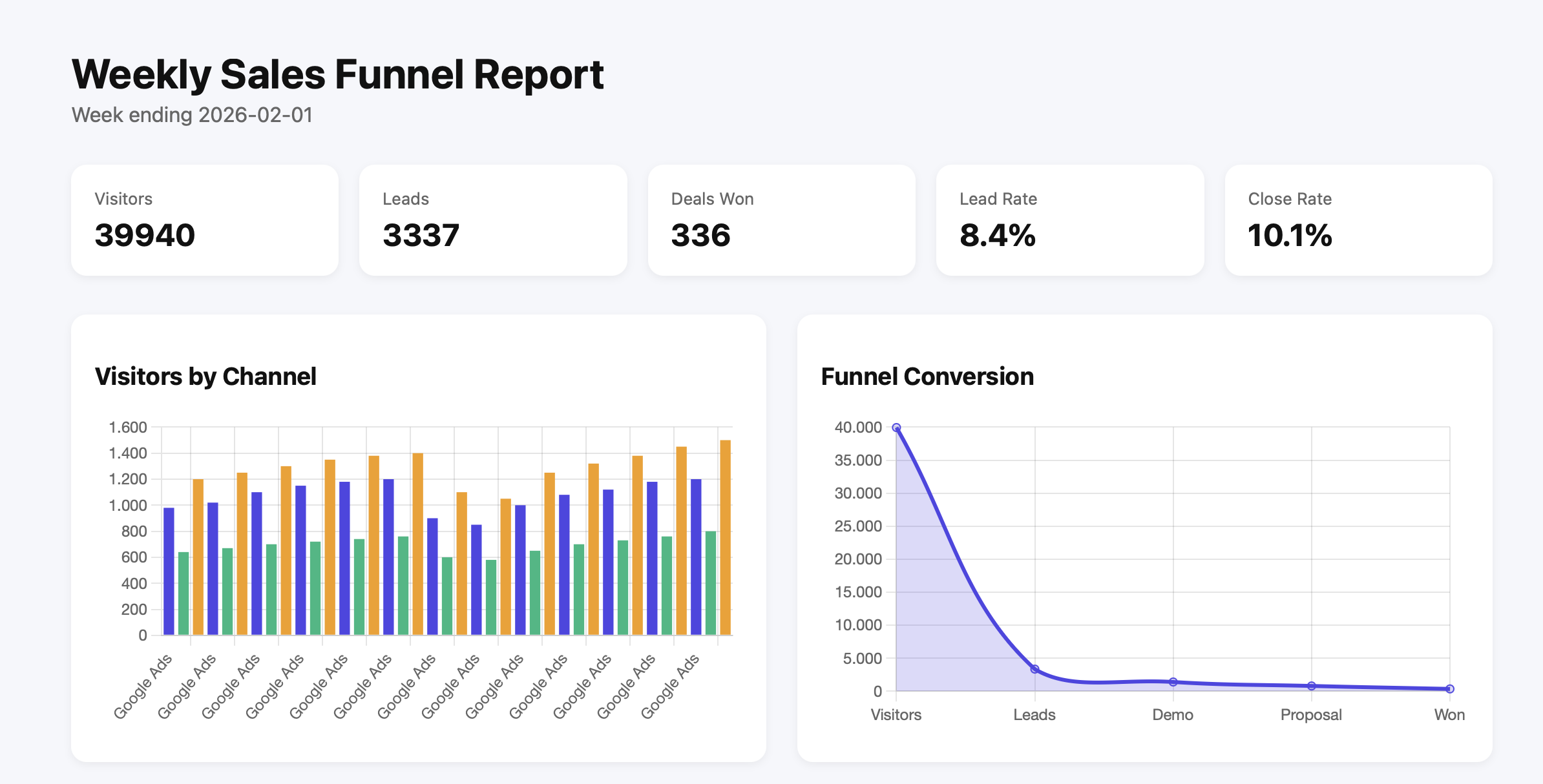
Live KPI dashboard with charts, metrics, and funnel visualization
Why This Workflow?
Creating dashboards manually or passing raw sheet data to visualization tools is time-consuming, error-prone, and hard to automate. Most solutions require:
Complex BI tools: Tableau, Power BI, or Looker with steep learning curves and high costs
Manual updates: Copy-pasting data, rebuilding charts, and republishing dashboards
Server management: Hosting infrastructure, SSL certificates, and deployment pipelines
Developer resources: Custom code for data transformation and visualization
This n8n workflow automates the entire process by converting Google Sheets data into structured JSON and feeding it directly into a CustomJS HTML template. The result is a fully interactive, production-ready KPI dashboard that updates automatically with minimal effort.
What This Workflow Does
The workflow orchestrates five key steps to transform raw spreadsheet data into a live, hosted dashboard:
Fetches KPI metrics from Google Sheets — Pulls data for visitors, leads, demos booked, proposals sent, and deals won
Aggregates metrics by week and channel — Groups data by time period and marketing channel for trend analysis
Converts to structured JSON — Transforms sheet rows into clean, chart-ready JSON format
Generates static HTML page — Builds KPI cards, interactive Chart.js visualizations, and data tables automatically
Hosts on CustomJS — Deploys instantly with optional custom domain connection (one-click setup)
All without manual intervention. Schedule it weekly, trigger it on-demand, or connect it to your CRM for real-time updates.
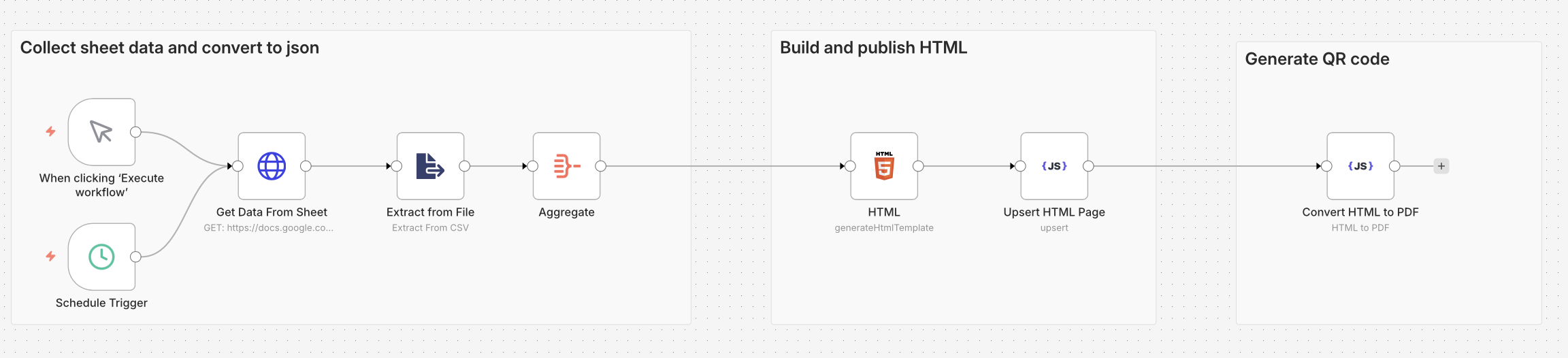
Workflow Architecture
The n8n workflow consists of six nodes that work together to collect, transform, and publish your KPI dashboard:
Complete n8n workflow: from Google Sheets to hosted HTML dashboard
Node Breakdown
1. Trigger Node (Schedule or Manual)
Choose between scheduled execution (e.g., every Monday at 9 AM) or manual trigger for on-demand dashboard updates. The schedule trigger is perfect for weekly reports, while manual execution works great for testing or ad-hoc refreshes.
2. Get Data From Sheet (Google Sheets)
Connects to your Google Sheets document and pulls all rows from your KPI tracking sheet. The sheet should contain columns for date, channel, visitors, leads, demos, proposals, and deals won. See the example spreadsheet for the expected format.
3. Extract from File (Data Transformation)
Processes the raw sheet data and extracts relevant fields. This node handles data cleaning, type conversion, and initial structuring. It ensures dates are properly formatted and numeric values are ready for aggregation.
4. Aggregate (Data Grouping)
Groups metrics by week and channel, calculating totals and averages. This node performs the heavy lifting of data aggregation, creating the summary statistics that power your KPI cards and charts. It handles weekly rollups, channel breakdowns, and conversion rate calculations.
5. HTML (Template Generation)
Builds the complete HTML dashboard with embedded Chart.js visualizations. The template includes responsive KPI cards, bar charts for channel performance, line charts for trends, and funnel visualizations for conversion tracking. All styling is inline for maximum portability.
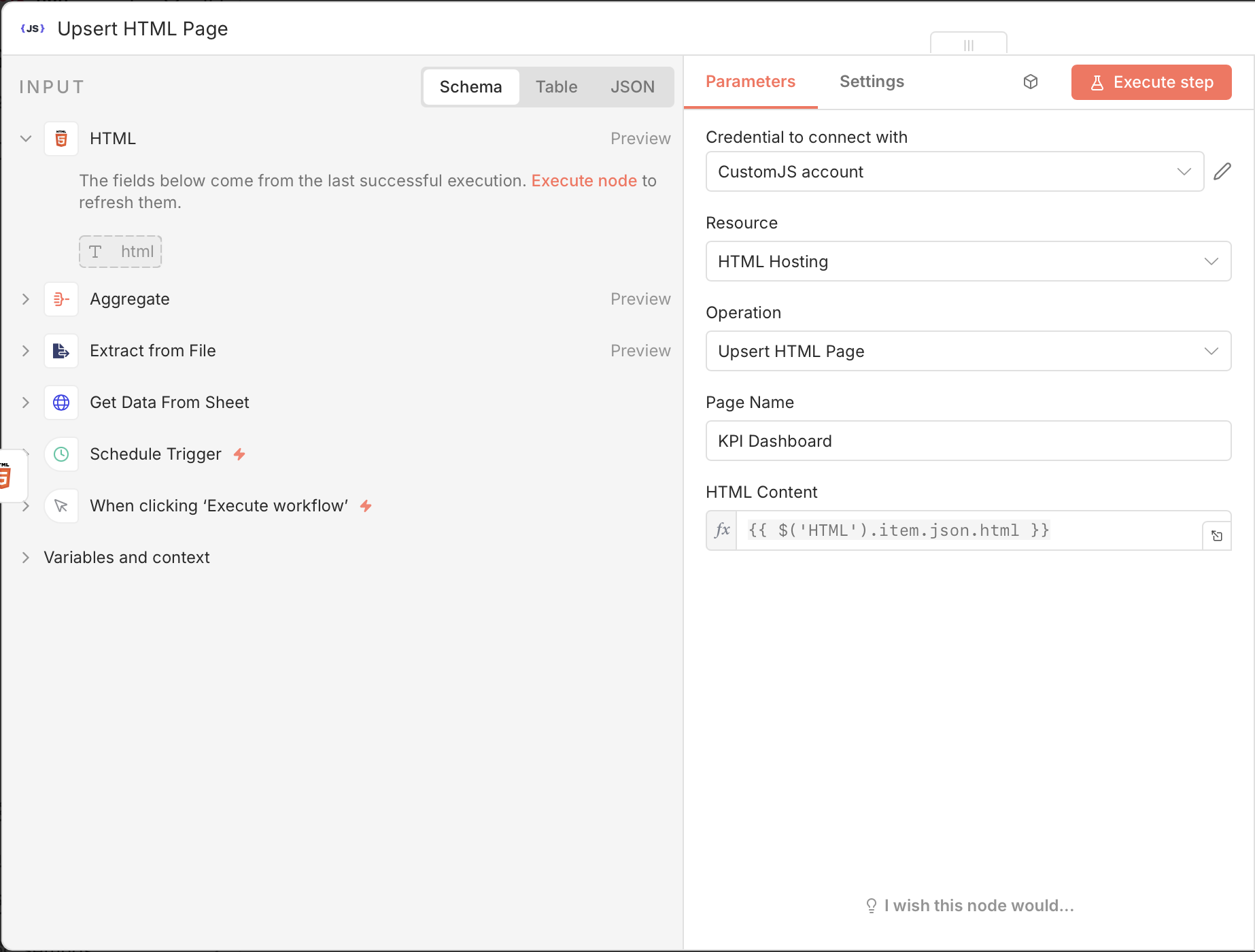
6. Upsert HTML Page (CustomJS Hosting)
Publishes the HTML dashboard to CustomJS hosting. Each execution overwrites the previous version, ensuring your dashboard always shows the latest data. The hosted page gets a unique URL that you can share with stakeholders or connect to your custom domain with one click.
CustomJS node configuration for hosting the HTML dashboard
Setting Up Your Google Sheets Data Source
The workflow expects a specific data structure in your Google Sheets. Here's how to set up your KPI tracking sheet:
Required Columns
Column
Type
Description
Example
Date
Date
Date of the metric entry
2026-02-01
Channel
Text
Marketing channel or source
Google Ads
Visitors
Number
Total website visitors
1250
Leads
Number
Qualified leads generated
105
Demo Booked
Number
Demos scheduled
12
Proposal Sent
Number
Proposals delivered
8
Won
Number
Deals closed
3
📊 Example Spreadsheet: Check out our sample Google Sheets template to see the exact format and sample data. You can make a copy and populate it with your own metrics.
Data Entry Tips
Consistent date format: Use YYYY-MM-DD format for reliable date parsing
Channel naming: Keep channel names consistent (e.g., always "Google Ads" not "google ads" or "GoogleAds")
Daily or weekly entries: The workflow aggregates by week, so you can enter data daily or weekly
Missing data: Use 0 for missing metrics rather than leaving cells empty
Historical data: Include at least 4-8 weeks of data for meaningful trend visualization
Key Features of the Dashboard
1. Automated KPI Cards
The dashboard automatically generates summary cards for your key metrics. Each card displays the total for the reporting period with clear, large numbers that stakeholders can understand at a glance.
Visitors: Total website traffic across all channels
Leads: Qualified leads generated
Deals Won: Closed deals and revenue
Lead Rate: Conversion percentage from visitors to leads
Close Rate: Conversion percentage from leads to closed deals
2. Interactive Charts with Chart.js
All charts are generated using Chart.js, a powerful and lightweight JavaScript charting library. The charts are fully responsive and interactive—hover over data points to see exact values.
Visitors by Channel: Stacked bar chart showing traffic sources over time
Funnel Conversion: Line chart visualizing the sales funnel from visitors to won deals
Weekly Trends: Time-series charts for tracking performance over weeks
3. Static HTML Hosting
The dashboard is hosted as a static HTML page on CustomJS, which means:
Instant deployment: No build process, no server configuration
Fast loading: Static HTML loads in milliseconds
Reliable hosting: No server downtime or maintenance
Shareable URL: Send the link to anyone who needs access
Custom domains: Connect your own domain with one click
4. Custom Domain Support
Want to host your dashboard at dashboard.yourcompany.com? CustomJS makes it simple:
Deploy your dashboard and get the CustomJS URL
Add a CNAME record pointing to CustomJS
Click "Connect Domain" in the CustomJS dashboard
Your dashboard is live on your custom domain with automatic SSL
5. QR Code Ready (Optional)
The workflow can optionally generate QR codes for the dashboard link, making it easy to share in presentations, printed reports, or physical locations. Scan the code to instantly view the latest dashboard on any device.
How to Use the n8n Template
Step 1: Import the Workflow
Visit the n8n workflow template page and click "Use workflow" to import it into your n8n instance. The template includes all nodes pre-configured with sample data.
Step 2: Connect Google Sheets
Configure the Google Sheets node with your credentials:
Click on the "Get Data From Sheet" node
Add your Google Sheets credential (OAuth2 or Service Account)
Select your spreadsheet and sheet name
Ensure your sheet has the required columns (Date, Channel, Visitors, Leads, etc.)
Modify the HTML template node to match your branding:
Colors: Update CSS variables for brand colors
Logo: Add your company logo URL
Title: Change "Weekly Sales Funnel Report" to your preferred title
Metrics: Add or remove KPI cards based on your needs
Charts: Customize chart types, colors, and labels
Step 5: Test and Deploy
Click "Execute Workflow" to test with your data
Check the CustomJS output for the hosted URL
Open the URL to view your live dashboard
If everything looks good, activate the workflow for scheduled execution
Code Example: HTML Dashboard Template
Here's a simplified version of the HTML template that powers the dashboard. The actual workflow includes more sophisticated data binding and chart configuration.
💡 Note: The actual workflow uses Nunjucks templating to inject data dynamically. The placeholders are replaced with real values from your Google Sheets during execution.
Optional Enhancements
1. Generate QR Codes for Dashboard Links
Add a QR code generation node to create scannable codes for your dashboard. Perfect for including in printed reports or presentations.
// Add this to your HTML template
import QRCode from 'https://esm.sh/[email protected]';

const qrCanvas = document.getElementById('qr-code');
await QRCode.toCanvas(qrCanvas, '', {
  width: 200,
  margin: 2
});
2. Include Multiple Charts
Extend the dashboard with additional visualizations:
Scatter plots: Correlation analysis between metrics
3. Historical Trends
Store previous dashboard versions to track changes over time. Add a node that saves each week's data to a separate sheet or database for historical analysis.
4. Multiple Data Sources
Combine data from multiple sheets or different sources:
Google Analytics for website traffic
CRM data from Salesforce or HubSpot
Ad spend from Google Ads or Facebook Ads
Email metrics from Mailchimp or SendGrid
5. Email Notifications
Add an email node to automatically send the dashboard link to stakeholders when it updates. Include a screenshot or summary of key metrics in the email body.
Best Practices and Tips
Data Quality
Validate inputs: Add error handling for missing or invalid data
Consistent formatting: Ensure dates and numbers are properly formatted in Google Sheets
Data freshness: Set up alerts if source data hasn't been updated recently
Backup data: Keep historical copies of your Google Sheets
Performance Optimization
Limit data range: Only fetch the last 12 weeks of data to keep dashboards fast
Aggregate early: Perform calculations in the workflow, not in the browser
Minimize chart complexity: Too many data points can slow down rendering
Cache static assets: Use CDN links for Chart.js and other libraries
Security Considerations
Access control: Use CustomJS's optional password protection for sensitive dashboards
API keys: Store credentials securely in n8n's credential manager
Data privacy: Avoid including personally identifiable information in public dashboards
URL obscurity: CustomJS generates unique URLs that are hard to guess
Maintenance
Monitor executions: Set up n8n alerts for workflow failures
Version control: Export and save workflow versions before making changes
Test with sample data: Use a test sheet to validate changes before production
Document customizations: Keep notes on any modifications to the template
Real-World Use Cases
📊 Marketing Team Performance Dashboard
Track campaign performance across multiple channels. Update Google Sheets daily with metrics from Google Analytics, Facebook Ads, and LinkedIn. Generate a weekly dashboard showing ROI, cost per lead, and conversion rates by channel.
💼 Sales Pipeline Visibility
Give executives real-time visibility into the sales pipeline. Connect to your CRM (Salesforce, HubSpot, Pipedrive) via n8n, aggregate deal stages, and display funnel metrics, win rates, and revenue forecasts on a live dashboard.
🎯 SaaS Metrics Dashboard
Monitor key SaaS metrics like MRR, churn rate, customer acquisition cost, and lifetime value. Pull data from Stripe, your database, and support tools. Generate a weekly executive summary dashboard with trend charts and cohort analysis.
🏪 E-commerce Performance Tracking
Track daily sales, conversion rates, average order value, and inventory levels. Connect to Shopify, WooCommerce, or your custom platform. Display product performance, traffic sources, and revenue trends on an always-updated dashboard.
📈 Agency Client Reporting
Create branded dashboards for each client showing their marketing performance. Automate data collection from ad platforms, analytics, and social media. Generate unique dashboard URLs for each client with custom domain support.
Troubleshooting Common Issues
Charts Not Rendering
Symptom: Dashboard loads but charts are blank or missing
Solutions:
Verify Chart.js CDN link is accessible
Check browser console for JavaScript errors
Ensure data is properly formatted as JSON arrays
Validate that canvas elements have unique IDs
Google Sheets Connection Fails
Symptom: Workflow fails at the Google Sheets node
Solutions:
Re-authenticate your Google account in n8n credentials
Check that the spreadsheet ID is correct
Verify the sheet name matches exactly (case-sensitive)
Ensure the Google Sheets API is enabled in your Google Cloud project
Data Aggregation Errors
Symptom: Metrics show incorrect totals or missing data
Solutions:
Check for empty cells or invalid data types in Google Sheets
Verify date format is consistent (YYYY-MM-DD)
Ensure numeric columns contain only numbers (no text)
Test the Aggregate node with sample data to isolate the issue
Dashboard Not Updating
Symptom: Dashboard shows old data after workflow execution
Solutions:
Clear browser cache and hard refresh (Ctrl+Shift+R or Cmd+Shift+R)
Verify the workflow completed successfully in n8n
Check that the page name in the Upsert node matches your dashboard
Ensure the CustomJS API key has write permissions
Pricing and Costs
This solution is extremely cost-effective compared to traditional BI tools:
Component
Cost
Notes
Google Sheets
Free
Included with Google account
n8n
Free (self-hosted) or $20/mo (cloud)
Self-hosted is free, cloud starts at $20/mo
CustomJS Hosting
Free (included in plan)
HTML hosting included with CustomJS account
Custom Domain (optional)
$10-15/year
Domain registration cost only
Total
$0-20/month
Compare to $70-300/mo for traditional BI tools
Traditional BI tools like Tableau ($70/user/month), Power BI ($10-20/user/month), or Looker ($3,000+/month) are significantly more expensive. This n8n + CustomJS solution provides professional dashboards at a fraction of the cost.
Frequently Asked Questions
Can I use this with other data sources besides Google Sheets?
Yes! The workflow can be adapted to work with any data source that n8n supports. Replace the Google Sheets node with nodes for Airtable, PostgreSQL, MySQL, MongoDB, REST APIs, or any of the 400+ integrations available in n8n. The key is to transform your data into the same JSON structure expected by the HTML template.
How often can I update the dashboard?
As often as you need! The workflow can run on any schedule—hourly, daily, weekly, or on-demand. For real-time dashboards, consider using n8n's webhook trigger to update whenever source data changes. CustomJS hosting handles unlimited updates without additional costs.
Is the dashboard mobile-friendly?
Yes! The HTML template uses responsive CSS and Chart.js is fully responsive. The dashboard automatically adapts to different screen sizes, making it perfect for viewing on phones, tablets, and desktops. Charts resize and reflow based on viewport width.
Can I password-protect the dashboard?
Yes! CustomJS offers optional password protection for hosted HTML pages. Enable it in your CustomJS dashboard settings to require authentication before viewing. This is perfect for sensitive business metrics that should only be accessible to authorized users.
How do I add more chart types?
Chart.js supports many chart types including line, bar, pie, doughnut, radar, polar area, bubble, and scatter plots. Simply modify the HTML template node to add new canvas elements and Chart.js initialization code. Check the Chart.js documentation for examples and configuration options.
What happens if my Google Sheets has thousands of rows?
The workflow handles large datasets efficiently by aggregating data in n8n before generating the HTML. However, for optimal performance, consider filtering to only the last 12-26 weeks of data. You can add a filter node to limit the date range or use Google Sheets' built-in filtering to create a "Dashboard Data" sheet with pre-aggregated metrics.
Can I embed the dashboard in another website?
Yes! The hosted HTML page can be embedded in an iframe on any website. Simply use <iframe src="your-dashboard-url"></iframe>. This is perfect for embedding dashboards in internal wikis, client portals, or company intranets.
Do I need coding skills to use this workflow?
Basic familiarity with n8n and JSON is helpful, but not required. The template is pre-configured and ready to use. If you want to customize the dashboard appearance or add features, basic HTML/CSS knowledge is useful. The n8n community and CustomJS documentation provide extensive examples and support.
Conclusion
Building professional KPI dashboards doesn't require expensive BI tools or complex infrastructure. With n8n, Google Sheets, and CustomJS, you can create automated, interactive dashboards that update on schedule and host them with a single click.
This workflow demonstrates the power of no-code automation combined with modern web technologies. By transforming spreadsheet data into structured JSON and leveraging Chart.js for visualization, you get enterprise-grade dashboards at a fraction of the traditional cost.
Key benefits:
✅ Automated updates: Set it and forget it—dashboards update on schedule
✅ Cost-effective: Free or low-cost compared to traditional BI tools ($0-20/month vs $70-300/month)
✅ No infrastructure: No servers, no deployment pipelines, no SSL certificates to manage
✅ Fully customizable: Modify charts, colors, metrics, and layouts to match your needs
✅ Shareable: Send the URL to anyone or connect a custom domain
Ready to build your own KPI dashboard? Import the n8n workflow template, connect your Google Sheets, and deploy your first dashboard in minutes. For more automation workflows and examples, explore our n8n integration guide and API documentation.
About the Author: This guide is maintained by the CustomJS team. We build tools that make automation more powerful and accessible. Questions? Contact us at [email protected]
Deploy HTML landing pages with a single API call. No Git, no build steps, no complexity. Perfect for AI-generated pages, campaigns, and prototypes. 600 free deployments/month.
Deploy HTML pages instantly without server setup. Perfect for QR code landing pages, event forms, and promotional campaigns. Automatic HTTPS, custom domains, Make.com & n8n integration. 600 free pages/month.
Automate lead generation and user onboarding with form webhooks. Connect forms to Make.com, n8n, and Zapier for instant CRM updates, email sequences, and team notifications. 600 free submissions/month.